Case StudY
CRANE
Crane is a simple social media platform bridging the growing technological gap between generations.

Roles
UX Designer
UI Designer
User Researcher
Deliverables
Competitive Analysis
Research
User Survey
Persona
User Stories
Site Map
Wireframes
Branding
Prototype
User Testing
Tools
Google Forms
Figma
Adobe Photoshop
Adobe Illustrator
Lucid Chart
OVERVIEW
PROBLEM
Current social media platforms have become too complicated for many older adults to use, which leads to a gap in communication and older adults feeling left out and unheard.
"I want to use social media like everyone else, but it is too hard to learn and I don't want to be a burden asking for help."
The user needs a platform that is:
1. Simple and direct
2. Beginner inclusive
3. Thorough, but not bloated
SOLUTION
A simple social media platform that goes back to the basics of social networking allowing those with little to no social media experience or an aging mind to learn and be included in digital communication.
RESEARCH
COMPETITIVE ANALYSIS

SECONDARY RESEARCH
41% of 65+ year olds use Facebook and 40% use youtube as their primary social media.
53% of adult Facebook users say they do not understand why certain posts are included in their news feed and others are not, including 20% who say they do not understand this at all.
56% of seniors over 65 with a college education use social media. (out of about ⅓ of general seniors)
It is expected that the number of people over the age of sixty will more than double by 2050. Globally, the group of people over sixty is growing more rapidly than any other demographic.
USER SURVEY
My first step in researching was a user survey in order to gain insights regarding the current use of social media:
-
Reasons for use
-
Most Common Platforms
-
Frustrations
The survey results have been divided between the respondents over 60 years old and under 60 years old.
OVER 60 KEY INSIGHTS
Out of 11 respondents*


UNDER 60 KEY INSIGHTS
Out of 34 respondents*

WHO'S RIGHT?

Younger generations think social media isn't accessible for older adults, while older adults think it is...This made me go in for some follow-up questions to dig deeper...


This survey respondent ranked social media accessibility for older adults a 4/5, but when asked what basic Facebook features she knew how to do she could only select 9/23 options.
There is a common pattern showing a disconnect between what older adults THINK they know how to do on social media and what they ACTUALLY know how to do.
PERSONAS


USER STORIES

DEVELOPMENT
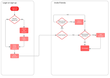
USER FLOWS
Click on a flow to see it larger*
SIGN UP and INVITE FRIENDS
JOIN A GROUP

SEND A MESSAGE

MAKE A POST

SITE MAP

SKETCHES


WIREFRAMES
USER TESTING

ONBOARDING
NEWSFEED
MESSAGES


BRANDING
LOGO & LOGOTYPE


-
A crane is used in the logo because it often symbolizes longevity, happiness, and good fortune.
-
“Crane” is also short and easy to say, which makes it easy for older users to remember.
-
Bright colors and simple imagery make it easily recognizable.
-
The red top in the crane head is not only anatomically correct but also creates an eye-catching contrast.
-
The red detailing on the “A” in the logotype creates cohesiveness between the imagery and the text, as well as a recognizable feature.
COLOR PALETTE

“Vision yellows with age. Older eyes are less able to distinguish between blues and greens. Avoid using a color palette that is predominately blue, green, or another “cool” color.”
source
“Using bright colors when designing for the elderly will help with acuity loss. While older people may like pastels, the colors may not be bright enough for elderly eyes... Peach color, warm tans and apricot, terra cotta, and pink work well...”
source

All font and background color combinations have a contrast ratio of 8.13 : 1 or higher and pass both WCAG AA and AAA for normal and large text.
FONT

I chose a sans serif font because the end projections on serif fonts can be visually confusing and distracting for elderly users.
It was also important to use a font with consistent stroke width because having an inconsistent stroke width can make words hard to distinguish.
Different weights allow for further clarification of hierarchy.
USER TESTING
TASKS:
-
Pretend you just discovered this app and want to sign up for an account.
-
Make a new post to share with your friends.
-
Send a message to a friend.
-
Try to join a Happy Hour group.
-
Change your account from public to private.
USERS:
Name: Bob
Age: 74
Profession: Retired Businessman
Name: Sue
Age: 70
Profession: Retired
Name: Robin
Age: 65
Profession: Retired Nurse
Name: Brandon
Age: 24
Profession: Student
KEY FINDINGS
-
Not sure where to go when changing the account from public to private.
-
No context for the word “Newsfeed” and unsure where to go to make a new post.
-
When directed actions were easy to follow, but missing context for usual “social media” words made tasks difficult.
-
Inviting friends/contacts slightly confusing because of copy and general lack of knowledge.
-
Joining a group was the most successful task.
RECOMMENDATIONS
-
Combine settings and account
-
Adjust the copy for the friend invite/adding selections
-
Adjust the copy and the icon for the newsfeed
-
Add an onboarding tutorial
ITERATIONS
ACCOUNT & SETTINGS

1. The "Account" and "Settings" pages have been combined to create a more concise information architecture.
NEWSFEED ITERATION

1. The icon and name have been changed from "Newsfeed" to "Home" in order to give more context to that page due to the lack of understanding of the word "Newsfeed".
2. The landing page for when you enter the app has been changed from the "menu" to the "home" to create more of a home base for the app because the menu can create decision fatigue for older adults.
INVITE CONTACTS ITERATION

1. The invite selection button now changes from "invite" to "invited" to better distinguish which button has been selected due to users forgetting which color mean selected after choices have been made.
2. The copy of the button has been changed from "Invite" to "Done" to better signify that there will be one more confirmation before the invites are sent vs the invites being sent right away when the button is pressed.
ONBOARDING ITERATION
Further testing was conducted to test the onboarding tutorial.

1. The grayed-out background was not dark enough, so it was darkened to make it more noticeable.
2. During testing it became apparent that many older adults have never seen an onboarding tutorial before and did not understand what was going on. A welcome pop-up was added to explain the process and give the user context.
HOME PAGE DESIGN ITERATION

FINAL PROJECT


FINAL THOUGHTS
-
Designing for the elderly is challenging but necessary if we want to close the ever-growing technology gap between generations.
-
I learned to let go of my initial desire for aesthetic and “cool” design.
-
Research played such an important role in creating CRANE because there are so many design elements that need to be considered when designing for an older adult. The color choices, fonts, button placements, and more all have research backing them.
-
I hope to further my knowledge of inclusive and accessible design and strive to come up with a way to make sure all generations are included as we rise with technological advancement.